Hello again, today I am going to be analysing another contents page.
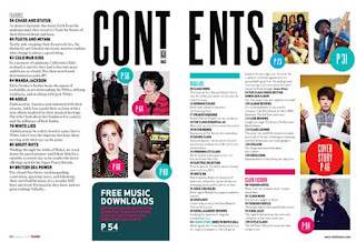
This is a contents page that has been put onto a double page spread. This is effective as it can include more space for advertising other artists. As well as more information on what the pages will be including, but more images have been included for effectiveness. By adding other things like star sign horoscopes, they are more likely going to catch peoples attention.
For a contents page, I rather it be on one page only as I like how everything fits perfectly. As my contents page will be mainly of images and writing, there won't be any room for further information such as advertisements or anything like that. As much as I do like the idea of having it on, there simply wont be enough room, everything would be squished and cramped otherwise.
There is a specific colour scheme running through this contents page. Black, white, blue and pink are the colours that stand out the most. Just by having simple colours can make it turn into something really outstanding and productive. The makers of this magazine have really thought about what the people in the images are doing, whether they are posing, holding props, wearing costumes that aren't necessarily from around our times, everything has been thoroughly th0ught about.
See my other posts about the colour scheme that I am going to use.
I like the way this contents page has been set up. By having the names of each of the pages all lined up is quite simple and original, but having images dotted around and not necessarily in order with the page numbers on can be a but confusing as you would be looking all over the page for the correct page to match the title.
There is a reason why I don't like the images dotted around, and it can be a chaos for other people too. Once reading the article headline, you try to find the image and your looking all over the page to find it. Why not have it right next to the headline, exactly what I am going to be doing.
On the other hand, as the images have all been placed all over the place over a double page spread and not just all stuck together, this cannot be called an image dominated contents page or the blocky look as they aren't really touching each other. I do like the idea of having the images just dotted around the page, but it looks a little messy to me.
I am going to be doing the blocky look as I think it looks neat and formal. I don't really like the idea of dotting the images around, so I am going to use other magazines as inspiration and do the blocky look for my contents page. Not a lot of other contents pages use the blocky look which I think is a shame as it looks really effective and productive.

No comments:
Post a Comment