Friday 24 February 2017

5) Double page spread analysis

This is a music magazine double page spread by Billboard. I searched and searched the internet for a magazine that was the same as my genre. However, I couldn't find any. So Billboard was my next best option.

The placement of the text is ironic as it looks like it has been written back to front. This makes it look effective and unique. I like how this has been done as nobody would think of doing this. This is what Billboard are known for, their uniqueness and capability of doing things that no one would think of and I really like that about the double page spread. The main title is placed at the top of the text in the centre, but not the centre of the pages as having it this was makes it look more professional.
The placement of the text is quite similar to where i have placed mine. I am going to be placing my text to the far left as well just like this magazine has but i am going to keep it normal. Instead of having 2 boxes of writing, i will have 3 so that the writing can be bigger so that it is easier to read.
The placement of the image is also quite important due to the fact that it is where the eye goes first when looking at a double page spread. This image of Beyoncé is placed on the right side of this double page spread, where they normally are for Billboard, and she is mainly on the right side apart form her hand, part of it is on the left side. I like how her whole image is on the right side, it shows her looking at her audience as if she is the Queen, showing she is the one who holds the power.
This will be where i am going to be placing my image in roughly the same place as the person I have took the picture is positioned the way I wanted it to be so that it looks right. My image will kind of run over the centre line as it's a big image and I wanted it to be so that people can see what she's doing in the image, even though it is clear what she's doing,
There aren't a lot of colours used for this double page spread. Colours such as purple, black, grey and white are the main ones used. Having purple and grey as the background is almost perfect as they contrast really well against each other. These are also the colours that make Beyoncé stand out more than it would if there was a black or white background.
I have a specific colour scale which I gathered peoples opinions and answers by doing a questionnaire. To view my results, go and have a look at my other blog post about that. The main colours that I am going to be using are grey, pale blue and black. I chose these colours because they are the ones that mostly suited my genre and is what my target audience wanted.
By having an image of Beyoncé on a double page spread, we automatically think that it is going to be about something important because she is the most successful artist in the world and the highest paid artist in the world, so obviously everyone is going to know who she is. By having a woman who represents empowerment and feminism, females from across the whole world are going to read about it.
My main  image inspiration is from Carrie Underwood because she is such an inspiration to many all over the world. Obviously i am not going to have her on my double page spread, but someone who maybe looks like her and is representing her can do the job.

Wednesday 22 February 2017

4) Double page spread analysis


Today I am going to be analysing another double page spread by Country's music magazine. I have been looking and I finally found a country music magazine double page spread. So here we go.

There aren't really many colours that have been used for this double page spread. Not a lot of double page spreads usually use a lot of colour. They're mainly a couple colours at the most and for this one, it's pink and white. These colours can mean a load of things like love, sentimental things that mean a lot to people. This is what country music magazines are about, they do what their fans love and include what they want to see.
See my other posts about my colour scheme. I have thought a lot about what colours I will be using and even did a questionnaire. If you want, go have a look at that too, to see my results.
These images have been thoroughly thought about before they were just placed on the double page spread.  Thinking about what kind of images are used is also another important thing to think about during the course of making it. However, the placement is another. Making sure that the pages look even and neat is an aspect that needs to be done correctly otherwise people would normally just skip the page.
I have thoroughly thought about what I am going to include for my images. I have also thought about where they will be placed. I'd like to keep it neat and tidy so that it looks presentable when people are flicking through a magazine. I'd want people to see my double page spread and think, nice and professional not sluggish and unprofessional because if the images were to be placed in different places and all on one page, people would think that you wouldn't have thought much about the placement, just that they have been placed on and I don't want people to think that.
On the other hand, whoever is in the image tends to tell another story. Whether they are promoting a clothing range, a celebrity story or whatever, the images always need to be thought about, as it's what draws people to the page. For example, this double page spread is promoting corsets as they are being brought back and what they are showing is that celebrities are wearing them, showing that fashion is being at it's finest. Not saying that everyone needs one, but that they are there for those who like them, therefore are being promoted.
As I am not promoting anything in my double page spread, I don't have to include anything other than an artist. As for putting a clothing range on my double page, there would be no need as I'm not promoting any clothes. The only thing I am going to worry about for imagery on my double page spread is who I am using and what they are going to be doing in the image.

Tuesday 21 February 2017

3) Double page spread analysis


Hello again. Today I am going to be analysing this music magazine double page spread. Again, I don't know who the maker of this magazine is as I couldn't find any other country music magazine double page spreads.

I really like the colours that have been used for this double page spread. It makes the beauty of the artist really stand out a lot more than it usually would with colour. By having the background colour grey, the writing black and the actual image itself in black and white, it means that it's all natural. it's how things were in the olden days before colour was around. It looks really effective and I like the look of it.
My colours are going to be quite similar to this double page spread as I am going to be using the grey and black coloured vibe, but instead of having the image in black and white, I am going to keep mine in colour as it makes the image stand out more. Just by having ordinary black font for my article on the double page spread makes it look bold and more appearing.
The image is of Adele. She's Britain's most famous and successful artist. Known for her cover of Skyfall for the James Bond movie, she has become really successful and well known through the years. By having Adele on the double page spread, people would most likely stop and read what has to be said as she is such an inspirational artist, who wouldn't want to read what has been said?
For my image on the double page spread, I have took inspiration from Carrie Underwood and Miley Cyrus as they are existing country artists. Obviously I cannot get photos of them for my magazine, so I have to use my friends for this task. To make it more interesting, I have made sure that I have included a photo of the artist that is going to be in the double page spread, on the front cover so that the artist gets their own story, just like Adele does in this magazine.
     The placement of this image is ironic because in my other posts I said that it is quite rare for a photo to be on the left side of the double page spread. so by having the image on the right side, means that it's showing her power and how much we love her. As she is looking off towards the right side (she's looking to the left, to be literal) it's making her look professional and outgoing.
Just like this double page spread, I am going to be placing the image on the right side of the page as it does seem to look more professional. However, the person in my photo isn't looking off the page, the artist is going to be playing the guitar to keep the professionalism in check.
The type of font used for this double page spread is a serif font. This means that the writing has a flick on the letters making it look fancy and formal. I do like the look of this font. However, I do prefer just having a normal sans serif font as it does look more professional and formal.
Like I said above, I am going to use a simple sans serif font. It's more professional and makes the page look neater and formal. I'm not saying I don't like the serif font, I just prefer to have something that seems to stand out more and is easier to read.


Sunday 19 February 2017

2) Double page spread analysis


Hey again, so today I am going to be analysing another double page spread. I don't know who this magazine is by. I only chose this one to do as there aren't a lot of country music magazine double page spreads around.
The colour scheme for this double page spread is represented throughout the whole thing as there isn't just one piece of colour in a certain part of the page, there's colour all over. The main colours used are grey, black and red. The red would normally be used for a headline to make that part stand out more against the rest of the page. However, as the colour of the background is just a plain grey colour, this could be either a rock/country magazine as those types of magazines include those colours.
As my colour scheme only includes 3 main colours which are pale blue, black and white, it means that the writing of the headline and the title will stand out and catch people's eyes, drawing them into the article. My headline and title for my double page spread will be the same colour to make sure that it is consistent.
There is only one image used for this double page spread and that's okay, there doesn't need to be a lot of images to make it look presentable. On the other hand, the image is placed on the left page of this double page spread. This is unique as not a lot of images are placed on the left side of the page. The way the man is positioned in the photo is almost as if he seems calm and collected, but the way he's is slightly slanted means that he doesn't care about what anyone thinks.
I will be including 2 images on my double page spread as only having one can make people bored, and I don't want that happening. As one of my images will be blown up so that it's over the half way line, it means that it looks neat and presentable. In addition to this, the person in my photo won't be as hard looking as the man in this magazine. My photo is just going to be of the artist playing the guitar and minding their own business as it fits my genre criteria.
As there is only one image in this double page spread, it means that not many people would stop and read the article provided on the page. However, if there were more images added, more people would be curious about what it's about and would want to know more about what the images are. On the other hand, by adding another image with a different colour added, people would become more interested as to why it's there and what it could be about.
(Read above)

Saturday 18 February 2017

1) Double page spread analysis

Today I am going to be analysing this double page spread. I don't know which magazine this is by, but it seems like it should be a Country music magazine as Carrie Underwood is a country  artist.                                                                      I can only see 3 main colours throughout this double page spread and they are grey, white and yellow. Country music magazines usually use quite bland colours meaning it's describing the genre using colours. As country music is quite southern and sometimes hard to understand, that's what the colours are implying.
Like this magazine, I am only having a few main colours which are going to be pale blue, black and grey. I chose these colours because like I said in the paragraph above, that because country music magazines don't usually involve a lot of colour, they revolve around a couple specific colours which is what makes it unique.
The main image used is a picture of Carrie Underwood. This is because the article is revolving around her. She's the main focus of the magazine. There doesn't seem to be a lot of images on this double page spread. There is a main picture of Carrie and a picture of a daisy in the top right hand corner. This can resemble the artist as Daisies mean pureness because of the colour, they represent happiness just like what Carrie does for her fans, she makes them happy.
For my double page spread, I am going to be using a big image, not as big as this one, but still a fairly large one so that it fills a bit of room. On the other hand, I am not going to be using a flower or anything for my magazine, I am going to be using a different image, a one of 2 artists, one of the artists is the one who is on my double page spread for the main image.
The placement of the image is quite ironic as the whole of the left page of this double page spread is dedicated to Carrie Underwood. This means that she is that important that she has a whole page to herself. However, all of the writing is on the right side of this double page spread. A lot of other magazines that I have looked at (will be included later) the writing has always been on the left side of the double page, not the right.
I will be placing my image on the right side of the double page spread and it is kind of going onto the other side with my separate image just above it. However, my article is going to be written on the left side of the double page spread and some of it will be going into the picture over the other side of the page. By doing this, it means that not only is there more room for more writing, but the writing is bigger and it looks more presentable.

Questionnaire analysis


I did an online survey where I made a few questions and got people on social media to answer them for me as they are my target audience and these are the results that I gathered.
Firstly, the colour scheme that people chose is a perfect match towards my genre as pale blue, grey and black are the colours that suit it really well. 80% of the people that answered my questionnaire picked this colour scheme.
However, for my front cover of what I am going to be having, 60% chose to have a girl/boy band, but I personally think that there needs to be a solo artist as all of the magazine front covers that I have analysed have all been solo's. The other 40% say that I should have a solo artist on the front which I agree with.
By having an interview based article for my double page spread, this means that more people are going to read it as they will be intrigued by what's going to be asked. A high 80% of the people answering said that an interview based article is what would be best for it. I agree as it's what I like to read when I get a magazine.
100% of the people who answered all said that the artist on the front cover should be featured on the double page spread. I also agree to this, as it makes it more interesting because the person who I chose to have on the front obviously has a story and something to tell.

Tuesday 14 February 2017

5) Contents page analysis


Hey, so today i am going to be analysing a music magazines contents page, but it's not of my genre. This magazine is from Q who are popular for their Pop music. I couldn't find any more good country music magazine contents pages so i had to use one of another genre.
The placement on this image is quite ironic as Adele has been positioned in a way so that she is looking up towards the camera and we are looking down on her as if we love her. By having this certain image this way, it means that more people would be curious as to what has been said about her and this is what makes people want to read the magazine.
For my music magazine, i am going to be placing all of my images in the middle of the page and have the writing around the image so that it's not hard to find which picture goes with each bit of writing. As my images will all be stuck together in the middle of the page, i feel as though not only will it look effective, but it will target my audience more as it looks more towards what teenagers would buy.
However, the colour scheme is again only a few colours such as Black, red and white. Q magazine always use the same colour for each of their magazines and by doing this, it means it's quite effective. Also by making parts of the page in a grey, gloomy colour, it's contrasting against the celebrities. So they've made it so that the celebrities look good, but whats being said about them maybe isn't so good.
See my other post to find out about my colour scheme as it will all be pale colours, as thats what country music magazines are like.
Because this contents page has only used 2 images, rather than say 7 or 8. It means that people may just skip the page as it looks boring. If it were to have a load more images on, then it would maybe look more appealing to the eye and more people would read it. However, as there is also a lot of writing on the page, more people may skip it because it just looks boring and unappealing. Others prefer to have content in terms of images, so they can get a grasp of who is being talked about.
Again, look at my other posts and see what i am going to do about the images. i am going to be using Carrie Underwood as my main inspiration for the front cover of my magazine and a few other artists for my contents page.

Monday 13 February 2017

4) Contents Page analysis

Hello again, today I am going to be analysing another contents page.
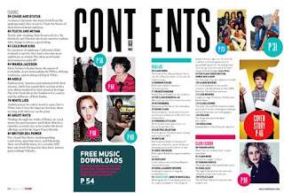
This is a contents page that has been put onto a double page spread. This is effective as it can include more space for advertising other artists. As well as more information on what the pages will be including, but more images have been included for effectiveness. By adding other things like star sign horoscopes, they are more likely going to catch peoples attention.
For a contents page, I rather it be on one page only as I like how everything fits perfectly. As my contents page will be mainly of images and writing, there won't be any room for further information such as advertisements or anything like that. As much as I do like the idea of having it on, there simply wont be enough room, everything would be squished and cramped otherwise.
There is a specific colour scheme running through this contents page. Black, white, blue and pink are the colours that stand out the most. Just by having simple colours can make it turn into something really outstanding and productive. The makers of this magazine have really thought about what the people in the images are doing, whether they are posing, holding props, wearing costumes that aren't necessarily from around our times, everything has been thoroughly th0ught about.
See my other posts about the colour scheme that I am going to use.
I like the way this contents page has been set up. By having the names of each of the pages all lined up is quite simple and original, but having images dotted around and not necessarily in order with the page numbers on can be a but confusing as you would be looking all over the page for the correct page to match the title.
There is a reason why I don't like the images dotted around, and it can be a chaos for other people too. Once reading the article headline, you try to find the image and your looking all over the page to find it. Why not have it right next to the headline, exactly what I am going to be doing.
On the other hand, as the images have all been placed all over the place over a double page spread and not just all stuck together, this cannot be called an image dominated contents page or the blocky look as they aren't really touching each other. I do like the idea of having the images just dotted around the page, but it looks a little messy to me.  
I am going to be doing the blocky look as I think it looks neat and formal. I don't really like the idea of dotting the images around, so I am going to use other magazines as inspiration and do the blocky look for my contents page. Not a lot of other contents pages use the blocky look which I think is a shame as it looks really effective and productive.

Saturday 11 February 2017

3) Contents page analysis

The colours used in this contents page co-ordinate well with the whole magazine and this is what makes a good music magazine, the colour scheme. It needs to fit in with the genre of music, otherwise it's not going to look good. However, as they have only used a few colours such as black, white and blue, it's contrasting with what the people in the image are wearing, meaning it's well co-ordinated and very consistent. The makers of the magazine have thought about what goes where and what colours they will use. Other country music magazines should be the same.
The colour scheme that I will be using is quite bold colours that will represent the images that I am using. To find out more on what I am going to be doing with my colours and what I am going to be using, look at my other posts.
The images in this contents page is neither an image dominated look or a blocky look, this is because there isn't a main image and there isn't a whole load of images packed together to make it blocky. In this case, it's just a normal, regular contents page. These are the type of contents pages you would see in a regular magazine, not a music magazine. On the other hand, the images do contrast well with the colours of the text.
As much as I do like the image dominated look, I do prefer having the blocky look of images on the contents page as it does seem to look neater than just having one images. What I was thinking of doing was either having 6-8 images all huddled together in hexagons on the contents page and I am going to try and make the edges where the other images meet each other blend together so that it looks like it's all one. So, this kind of makes it look like it's an image dominated contents page, but it's actually a blocky look.
The type of font used is sans serif, meaning that the text is bold and clear. By having this type of font, it is allowing us to be able to read it easier than it having a serif font, meaning it's a more fancy font that may be harder to read as the flicks on the letters are more excessive and prominent. However, a sans serif font is making the contents page neater than a serif font because it looks more clean virtuous.
I like the idea of using the sans serif font for my contents page for the music magazine because of what I said (what's written above in black) about it looking more bold. I also wrote more about what I thought in my other 2 posts about the contents page, go have a look and see what I am talking about.

Title ideas for the music magazine

Hey again, so today I have been thinking about some titles for my music magazine. In order for my magazine to be at the best it can be, it needs to have a good title. It's one of the main aspects of a magazine. Here are my ideas:

  • C is for Country
  • Country Life
  • Country's Finest
  • The Weekly Country
  • The Daily Country
  • A Day In The Country Life
  • Countryfied
  • The Western Swing
  • Hilbilly
  • The Western Times
  • The Country Times
I like all of these ideas as they are all short and catchy. However, there are only a couple that stand out for me. "Country's Finest" and "The Country Times" are ones that really stand out for me. These are good for titles because country music is always fine and soothing to listen to. Not only this, but there are a lot of country artists who are always being talked about in the daily news.
So, the thing that makes a good title is not only what it says but it's also to do with the font. I don't know what I am going to be using for the font yet, but I will keep publishing to keep you updated on what I think of the different fonts and what suits the title.

Thursday 9 February 2017

2) contents page analysis

Hey again, so this music magazine contents page is by Q, who is very popular for Pop music magazines. However, i could't find a lot of country music magazine front covers as they're mainly ones of just regular magazines, not music based ones. So, today i will be analysing a one by Q and i will be analysing the difference between them.

There is a main attraction towards the colour of the font for me, as this magazine is including only 3 main colours, black, red and white. They are basic colours but they are what make the magazine stand out even more. By having the text written in a large sans serif font at the top of the page is what will tell people what page they are on. However, by having the title of the magazine right next to the title where it says content page, is also another way of knowing what they are reading and it's basically self promoting, by putting themselves in their own, magazine is helping more people buy it. 
As i like bright and attractive colours as they stand out more rather than a bland colour, I really think that having a dark and bold colour would match my genre, so I am going to be using a sans serif font in black as I really think that it represents my genre. Other country music magazines that I have analysed have been using black font, so i am using that as inspiration. This magazine doesn't have a "Blocky look" because there are only two images on the contents page. As there is a fairly large image, this is an image dominated contents page which i personally quite like because we'e getting to see the bigger image of who is on the front cover and we get to see more of an insight of the artist and get to know a little more information that may not be included on either the front cover or the double page spread.
To see what i think of the "Blocky look" have a look at my other analysis of the contents page. It will tell you what i think of it and why i think that an image dominated contents page would suit my genre more. The amount of people that buy the magazine all depends on the artist that is in the image. If it were an artist that not many people know, then not a lot of people would buy it, however, if it were a famous artist such as Taylor Swift, a country artist, then people would most likely buy it as people love her. 
Again, to see who i think of taking inspiration from, celebrity wise, have a look at my previous analysis of the contents page. I honestly think that by having someone that you look up to on the front cover of your favourite magazine is what will make people buy it, so by having a celebrity that is well known, and is categorised with your specific genre, then people would most likely buy it. For example, country artist like Shania Twain, Elvis Presley, Willie Nelson and even Miranda Lambert are all celebrities who people look up to. It all depends on the image that is on the contents page, that people will read the magazine. However, depending on what has been said, a lot of people are bound to read it if something good or bad were to be mentioned.

1) Contents page analysis


This music magazine contents page is more of an image dominated contents page. This look ensures that the whole front cover is mainly covered by the image. This is because it gives the reader a better look to see what will be included in that specific page. However, because of having a fairly large image, particularly for the contents page, it's not allowing there to be a lot of room for the writing so this means that there won't be a lot of content for writing about the stories that will be included. 
Although i like the image dominated look on a contents page, i find that the "Blocky look" may look better because of the colours that i am using may match with my images that i will include. Including multiple images to make it look like a collage is what i would like to do as it think it would look very effective. 
As this music magazine is using the font sans serif, it's showing that it is not a fancy magazine, unlike other specific magazines like Pop, Hip Hop etc. However, as this magazine doesn't use fancy fonts, that doesn't particularly mean that it's not a well written magazine. It still includes the conventions of another music magazine, just the font is slightly different. In addition to this, the font is also different colours, specifying what each title is for. So there's the title of the headlines in black, the name of the artist in pink and so on. On the other hand, there are bolder parts of the text giving the headline a summary. 
For my music magazine, i am thinking of using a serif font because i like the way that it looks as it's not too fancy but it's quite bold at the same time. I could use it for onomatopoeia as the text will look bold and boring but the context will be showing more than that, it will seem that the magazine is shouting but not really. However, i will also be using a couple of colours that i am using for my front cover. So including them colours into the contents page will make it look more co-ordinated and consistent.
In this particular music magazine, there aren't a lot of images, even though it is more image dominated than the "Blocky look" this is because it's not full of images but then it does have a few images which are taking up most of the page. Again, the type of image is important due to the fact that, that is what will gain people's attention. Depending on who the image is of, needing to be a country artist to be able to attract those who are fans of the country music magazines, it needs to be an important celebrity who everyone adores in the music industry.
I am going to base my images on solo artists such as Carrie Underwood as she is a country singer who is very inspirational towards the people of my target audience. However, other inspirational country artists like Taylor Swift and Dolly Parton are good examples of what i would take pictures of. Having someone who not only looks like a celebrity, but dresses like a celebrity would definitely be what i need to take photos of. 


Wednesday 8 February 2017

5) Country music magazine front cover - Olivia Newton-John


Hi again, getting back to the front cover analysis, here's another one.
This magazine is based on one person and that is prominently shown through the image. This is why the main image of the magazine is the most important part of the whole magazine. Not only does it help with attracting people's attention, but it helps attract the attention of the people who buy the magazine partially because it's their favourite genre of music.
As I have mentioned before that I like the idea of having only one image to be the main focus, I would like to have multiple images to help with the co-ordination. You can have a look at my other posts for what I am doing for my music magazine in the imagery convention.
The placement of this image is again quite ironic because if you look at other country music magazines, the images are mostly placed in the bottom right hand corner of the magazine. This can be because of multiple reasons, one of which is because the text reads from left to right and it makes sense to have the text written on the far left side of the front cover. It may also be because that, that is where everyone's eyes are most likely going when looking at the magazine. However, the fact that there aren't any more images on the front cover prove that Olivia Newton-John is the main focus of the magazine.
Like all other music magazines and particularly country ones, the placement of the image is completely up to the designer and I personally think that having the image in the middle of the whole page makes the image pop. Thinking back to the rule of thirds, this would help make the main image be the main focus by having it in the middle of the page. 
Not a lot of colour is used throughout the front cover of this music magazine. This can be because every country music magazine has their own style and colour. The main colours that have been used are blue, yellow, black and white. They are pretty basic colours but they also help make it stand out which is what people look for in a magazine, particularly country magazines for people who like listening to country music.
Looking through a lot of other music magazines, again I like the idea of having a few colours on the front cover as it helps to stand out. Take a look at my other front cover analysis' to see what I think of this and what I would do to my front cover in terms of the colour scheme.


Research into Target Audience

Hey, today i have been looking into target audiences and what you need to do to be able get the correct grade that i want.
In order to get the grade that i want, i have been asked to look into the target audiences that fit into my genre that i have chosen for my coursework.
The things i need to look at whilst doing this research is to consider their age, gender and interests so that i can get more information about what they like in music and why they like it.
Some of the questions that are relevant to ask are things like what is your favourite band, or asking them to name 3 of their favourite bands is more efficient as you would be getting different results from every person in the target audience. 
However, by asking them other questions such as do you buy music magazines is a good way of getting information for charts and graphs.

Tuesday 7 February 2017

4) Country front cover - music magazine - Johnny Cash


Hello, today i will be analysing this music magazine by Country. Take a look:
The colours used in the front cover of this music magazine are quite bold and bland as the main colour is black and white. However, there are a couple colours that make the writing stand out such as orange and grey. This helps the magazine stand out more and to help catch the eye. The writing is in the colour of either black or white and this may be because it's not boring or anything like that, but because it's showing the age of Johnny Cash through the magazine. As he is quite old now, that is being reflected through the front cover of this magazine. 
I really like the colour theme that is running through this magazine front cover. I will be using this as an inspiration towards my own front cover as the colours that has been used will be of a use to me. As the colours are not bright and colourful, they are bold and dull, but that doesn't matter to me as i think that the colour matches my theme and the images that i am choosing will match with the colour.

The placement is again, quite ironic as there is only one main image used so that is where the eye goes when focusing on the magazine. However, the placement of the writing is important simply because of the way the image is set up, it's so we can know information about the main image of the magazine. On the other hand, the placement of the orange text and information also means that our eyes are more drawn to that side of the front cover. 
Again, i like the placement of this image as it is right near the centre and is definitely eye catchy. So, in order for me to be able to get the look i want for my magazine front cover, i am going to use this front cover as an inspiration so that i will be placing my images around about the same place in order to achieve what i want. However, the way that the titles and headlines are placed are also in specific way that i would like to use for my own magazine. I like how the title of the magazine is at the top and i will do this for my own, but i would like to add more headlines so that it makes the magazine more interesting so that people would want to read it.
The type of image used is showing the genre. So depending on the artist that is on the cover, it is showing us the type of music. As it is a country music magazine, it will obviously be a country artist. But, other music magazines will not be as obvious in showing the genre of the magazine as the title will be different. The image is definitely an important piece for a front cover as it needs to be eye catchy, informative and fashionable to get more views.
The image that i will be using will contrast well with the genre that i have chosen. I like to have the image match with my genre as it will help the magazine co-ordinate well with each other. Again, i will be using more than one image to help with that.

Monday 6 February 2017

3) People Country Special front cover - Blake Shelton

The placement of the picture is quite ironic as the main focus is obviously about him. The fact that the image is placed directly in the centre of the magazine is also quite noticeable and important due to the fact that he must be the most talked about throughout this magazine. The placement of the other images are also quite ironic as they are nearly lined up with the bigger image. This is helping the readers get a nice and clear guide at what they are reading.
For my music magazine, i am going to be including multiple images to get the same idea across just like this magazine has. Also, the way that the images are placed in specific shapes also adjusts to the way we see them. I also like the way that the title of the article is placed at the bottom on the magazine, meaning that's where the eye's are most likely to go last and gives out the most information.
There is a specific theme of colour that runs through the magazine and is also quite important in terms of the contents page and the double page spread as they should include the main colour. As the main colours in this magazine are red, yellow and black, this theme should run throughout the whole magazine to colour co-ordinate the whole thing. As the background colour is white, it really makes the colour of the title stand out more. 
I really like the colour scheme used for this magazine as i think that they go well together. Having the coloured text spread out so that it goes red, black, red and then yellow makes it look more effective. However, by only having 3 pieces of text that are in one specific colour, yellow, is making it more eye catching and appealing as it is where the eye is most likely to go when looking at the magazine. 
The images used are a very important aspect of the magazine as it's all about what people like and the types of music people listen to. The type of magazine all depends on who is on the front cover, so it need sot be genre specific. In order to do this, a magazine that is a Country genre, needs to have a country artist on front, so Blake Shelton for example. The choice of images are also targeting those of a different audience making more people buy the magazine. Having people like Jake Owen on the front cover is making the news be more aware. 
The images i choose for my magazine front cover is an important choice as i need to be able to target those within my target audience but i also need to be able to make it presentable and people would need to read it. Also the images i choose need to be colourful so that they would be eye catchy. On the other hand, i would need to place the images in a specific order as then it would look well co-ordinated. The images i would need are single artists who are promoting tickets for their shows and other pictures like that.

Friday 3 February 2017

2) Country Music Live front cover - Music magazine

This music magazine is a perfect example of what we need to do for our task. A clear image is shown to help the reader know who is going to be mentioned in the article. A lot of colours are used to help draw the attention towards the magazine. The colour is a very important aspect of a music magazine, or any magazine in general as the title needs to be bold and clear for the reader to see. By having colour in the title, allows the magazine to stand out more.
For my magazine, i am going to be only using a couple of colours so that it would contrast well against the background colour. The main colour theme i will be using is black, as it is a dark colour that really stands out and catches people's eyes. As the colours that i am using are quite dark and dull, i still think that it is quite an original idea. I may also include a pale blue colour to again contrast and blend together the whole magazine front cover.

                 However, by having short and catchy headlines for magazine articles, it helps catch the viewers attention and not only this, it helps to keep the consistency of the magazine in check and to make sure that the titles of the articles are spread out to make it look decent. The colours used in the music magazine are very colourful and bold to make sure that it stands out. The main colours used are blue, red and yellow. These are the primary colours meaning that the magazine is being kept simple and original. The headlines of the articles are just in a plain white font, this allows the reader to clearly see what's been written. 
Another important thing about a magazine front cover is the headlines so that it will give a story for inside of the magazine. it's what provides the information and gives us the little details that helps us know what the actual story is about. As this magazine has a lot of colour put into the headlines and titles, i am only going to be using a couple colours like black and a pale blue so that not only will it stand out but it will look neat and formal so that it's easy to read. I will be using a serif font to help with making it clear.

The placement of the celebrity is also another very important part of the front cover of a magazine as we need to clearly be able to see who it is and whats being said about that person. So, for this magazine, "Country music live", they have a picture of Shania Twain who is dead centre of the magazine, making sure that she is the main focus and that's where the readers eye always go. However, as this music magazine doesn't really have any more pictures other than the one of Shania Twain, people would less likely read it as it just looks plain and boring. But, on the other hand, it has a contest available for everyone to take part in.
I do like the idea of having the image in the middle of the front cover, so i am going to make the image be in the middle, but slightly towards the right. This will mean that the focus will be on the main image. As the music magazine doesn't include other images, just a coloured box with writing in saying that a contest will be taking place, i will also be doing this. However, i will be adding a couple more images so that again, the magazine will stand out.

1) Country music magazine front cover - Dolly Parton

This music magazine is quite original as the colours are dull and don't really stand out as much as other music magazine front covers. However, this one only include a few colours and they are black, grey and white and because of this, it contrasts against the outfit that Dolly is wearing. Having a blue, red, orange and many other colours in an outfit against a grey background is going to make Dolly stand out. On the other hand, having the title in the colour black against a white background means that it will definitely catch the viewers eye. By having big and bold writing is another way to grab the readers attention and because of using someone as famous as Dolly Parton, people would want to know what it's going to be about.  
For my music magazine, i will have a grey and white background that contrasts well together and blends so that it is genre specific. It will not also help with the genre but it will also make my image stand out as the outfits will be colourful and bright, as the costumes usually are for country singers. For my headlines and titles, i will be using either black or white as it will contrast well with the background colour and the outfit that the person is wearing in my image. 

As Dolly is placed slightly towards the right but still quite centred, it's showing us that she is quite powerful in the music industry as she has the whole front cover to herself. The placement of the title is also important throughout this magazine as we get a clearer image of what it says. By having the "Dolly Parton" written in white and to the left of her, we get a better understanding. for those who don't know who she is, know who she is. Dolly is placed in front of the title of the magazine showing that she is the most important thing in that magazine. 
Throughout my front cover of my music magazine, i will make sure that the image is centre and i will make sure to use the rule of thirds to help me with that. Also, my title of the magazine will be either at the left side of the magazine or the right, i haven't decided yet. As this magazine doesn't have a lot of headlines or titles, it just has a title of the actual magazine and the name of the celebrity, i will use this as an inspiration to make the title bold and have it placed at the top of the magazine. 

A lot of other music magazines only include a few images. However, this one in particular only includes one image of Dolly Parton. This is showing that she is the main focus for one of the articles and that she may be mentioned in multiple. I like the idea of only having one image as it limits the amount of focus that there is on the whole page of the front cover. Also, by only having one image also shows that, that is where the eye goes first when looking at it. However, by having more images, it would make the reader be more intrigued as to what the magazine entails. 
I really like the idea of having one image that is centred on the magazine but for my magazine i would really like to have more than one image so that the reader would be more likely to view the magazine to keep them interested. On the other hand, i would like to include images of celebrities that i would use my friends for as i would like to include something to do with a competition for the viewers to win tickets to see their favourite celebrities live. I will also include images a celebrity who is about to go on tour and that the tickets are now on sale. I like the idea of having more than one image as it would definitely, most likely catch more viewers attention.

Thursday 2 February 2017

Example - Kerrang music magazine

During the course of this project, we have been researching some existing music magazines in order to find some inspiration to when it comes to making our own. The specific things that we need to focus on are the target audiences as we need to make sure that our genre fits to the target audience perfectly. As well as the target audience, we need to ensure that we can target a specific gender, depending on the type of genre of the music magazine, the gender choice needs to fit. However, the colours that are included in the magazine are a big part of what the magazine. For example, on the magazine "Kerrang!" the colours are all dark like Blacks, greys and whites. This is meaning that the magazine is aimed towards older teenagers as that kind of resembles what some teenagers are like, the ones who like the dark/ heavy metal kind of music. The magazine also includes the colour gold which means that it includes a bit of class to balance the colour scale. 
                                         To make sure that the audience is being targeted correctly, the magazine includes a wide range of advertisements such as "Relentless" and including pictures of musicians to help target a wider range of audiences. However, the magazine is all about the images that have been chosen. Depending on the target audience and the genre, the range of images is up to you. So for the Kerrang! music magazine, it has a picture of an intimidating man standing in the middle of the page. This is where the rule of thirds comes in and is a very important part of the magazine as it helps to show where the eyes mostly focus on, on the magazine.
                                          On the other hand, a title for your magazine is the most important thing on there. Again, depending on the genre you choose, the title is all about what you would imagine it to be. Another example is Kerrang! again as it symbolises a loud and aggressive sound. It's onomatopoeia, meaning that there is a loud noise used to resemble the title. Finally, to make a successful music magazine, it needs to be consistent, meaning that the whole magazine needs to co-ordinate with each other and it needs to be genre specific. The genre needs to 100% fit the target audience so that people of that genre would look and read the magazine.

Initial Ideas


In order to know what kind of music magazine we wanted to create, we had to come up with a few ideas to help us with doing so. So, we got asked to create an Initial ideas page full of information of what we were planning on doing with our music magazine which includes names for our magazines, colours, costumes, where we got our inspiration from etc.

Wednesday 1 February 2017

Preliminary Task

This is our Preliminary task which is what we got asked to do. This is my front cover and contents page where we explored different techniques including Photoshop and InDesign where we created our tasks. Before creating my front cover and contents page, we did a little bit of research into what they looked like and what the needed to include. For example, we needed to really focus on the colour scheme as it should represent our school, so i included the school logo to help people recognise the school. As part of the task, we were asked to take our own photos to help the reader get a better understanding of the article. Throughout the whole task we had to make sure that it could pass as an actual school magazine to determine whether we pass or fail and continue on to doing the course. During the making of the contents page, i included a lot of photos throughout to again help the viewer, and so that it's not just all writing and that there are photos to make it more interesting to grab the readers attention and to make them want to read it.