 I have changed the sub-headline again because i thought that the text was too bold for it to be a sub-headline, so by adjusting it and keeping it the same font, but changing the boldness and how much it slants, it looks like a proper sub-headline.
Friday, 31 March 2017
Double page spread adjusted sub-headline again
I have changed the sub-headline again because i thought that the text was too bold for it to be a sub-headline, so by adjusting it and keeping it the same font, but changing the boldness and how much it slants, it looks like a proper sub-headline.
Contents page added circles
 I have added circles around these circles because i feel as though there should be a theme running throughout the whole of the magazine. On my contents page, i have done the same thing around the circle with the social media links on.
 I like having something around the circles as it adds more depth to the page. It also helps to fill up the space a little bit more.
I have done the exact same thing for this circle that is in the middle of the text. By having these circles in those places, it makes it look a lot prettier and more to my genre more.
Thursday, 30 March 2017
Contents page update
 I have decided to not only have boxes around the text of what the pages are about, but i have also added boxes around the pictures. This helps the page and just the pictures in general look neater and more in line with the text.
I really like the boxes as it kind of fills a really small amount of space on the page, but it also adds to the look of the contents page. I wanted to originally have an image dominated contents page, but it didn't really turn out well and i thought that i needed more images, so i chose to do the blocky look instead and it looks quite good, though it's not finished yet. I'll update you when it is finished.
Wednesday, 29 March 2017
Peer reviewing
Yesterday we did a peer review of each others work. By doing this, it allows us to gain feedback on how we are doing from another person's point of view. However, this also gave me improvements that needs to be done to my magazine and also my blog. I really liked what we did as it gave me a chance to see what other people are doing and how different everyone's work can be and also get inspiration for what i can blog about.
Tuesday, 28 March 2017
My Article
Q: Obviously every celebrity gets hate comments, but how do you deal with them?
A:The way every other celebrity deals with it really, just to ignore it and try to move on with my life. By letting all the comments get to you is not doing anything good for you, you just got to deal with it and try not to let it get to you. There are some pretty hurtful comments floating around social media these days, but all I say to myself is “They must have nothing better to do with their lives if they keep talking about me” I mean why talk about me if you don’t even like me. So yeah, just to ignore it and push past it, get through it as if it’s just a cold.
Q:Could give your fans a bit of advice about bullying and maybe talk a little about your experience with bullying?
A:A bit of advice for my fans would probably have to be to not let anyone get you down, all those bullies that you witness, there are simple things that you can do to help yourself or anyone else in need. Tell a teacher if it’s getting bad, but most importantly tell a parent. I remember when I was in middle school, I was constantly getting bullied because of my looks, the clothes I wore, the little things that you wouldn’t think mattered. I got bullied for all those things. The worst part was, I didn’t tell anyone about what was happening, I didn’t tell my parents, or a teacher. I dealt with it. I grew up to be the woman I am today just pushing past the haters and ignored them. That’s what I would say to my fans, to ignore it and tell an
adult, it’s not the end of the world.
Q:If you could go backto when you were younger and give yourself one bit of advice,what would it be?
A:Going back to when I was younger,I’d probably tell myself to not care on what anybody thinks
of me. I was very self-conscious with what I looked like and the only way to carry on with my life was to just keep my head down and not make eye contact with anybody. So I would tell myself that it’s their own opinion and it doesn’t matter, all that matters is my own opinion, no one elses, and to never forget that.
Q:Enough about that, lets talk music. So what does your music mean to you?
A:Music is everything to me, it’s practically my life. It helped me when I was down. It was the only thing that helped me with my problems. I could write down all my fears and problems and make them into a song and I wanted to share that with the world to help people who were my age when I was dealing with bullying you know. I want to inspire younger children to be who they are and to not let themselves get down because someone says they aren’t capable. Music, in my eyes, is my life and no bully/
hater is going to stop me from doing what I love.
Q:What do you think defines artist?
A:An artist to me is someone who can inspire someone else just by singing a song. An artist is also someone who can pour all of their emotions into a song and help teenagers get through with their lives.
Q:Whats it like to be touring the world?
A:It’s incredible. I never thought I’d get the opportunity to sing songs to the world, let alone tour it. It’s the most amazing feeling going out on stage and seeing all my fans singing along and holding signs up. It gives me the chills, because they inspire me to do what I’m doing.
Double page spread adjusted sub-headline
 I decided to change the font of the sub-headline from the font Goudy Old Style, to Myriad Pro.
I did this because the font matches the font of the writing in the circles, and this helps to show a theme running through the double page spread.
Double page spread update

I decided to have the circle straight because when it's on an angle, the writing isn't straight so by having the circle like this, it's keeping it safe and i feel as though it looks better.
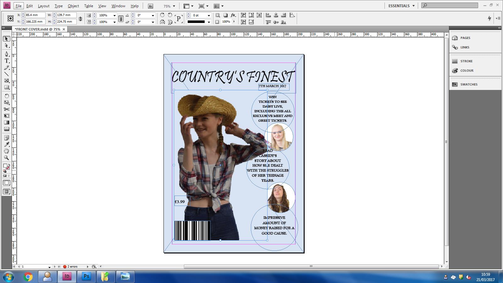
Front cover photo update
This is the updated version of the front cover of my magazine. I decided to change it because i thought that the other image was too much. The person in the image was looking right at the camera, whereas the front covers that i have analysed don't tend to look at the camera, so i changed it. This is what it looks like.


Monday, 27 March 2017
Front cover photo adjustments

Regular image - Unphotoshopped

Photoshopped image
I decided to change the image for my front cover again because i thought that having the person in the image smiling at the camera was something that people on the front cover of magazines don't normally do. So, in order to have something different, i decided to have the person in the photo pose a little bit but not too much and to have them looking in another direction, besides looking at the camera. I like the overall look of the photoshopped image so i am going to put it on my magazine and i will do a separate blog to show you how it looks.
Contents page title
 I have added a line under the title of the page as it helps the title be more bold and grabs the attention more. I wanted to have something under the title because it just filled up the space a bit more but also helps to underline the title of the page.
I explored with the different types of lines that there were and have put a few of them into another blog for you to see. For example, there were dotted lines and dashes, slanted slashes etc.
Underlining ideas
These are a few examples of what underlining techniques i could have for my title on the contents page. I like all of these but just having something simple makes it stand out better. I feel like having something like the diamonds can ruin it and it wouldn't have a better effect. 


This is the one that i am going to be using because it's simple, effective and still stands out even though it's nothing much.


This is the one that i am going to be using because it's simple, effective and still stands out even though it's nothing much.
Contents page social media update

I have made a small addition to my contents page just to fill out a little bit more space and to make the circle look neater than it was. I really think that this addition has made the whole page stand out more, it also helps focus the attention more to the centre of the page so that people would be more likely to see the social media links and go follow them.
Friday, 24 March 2017
3) Posing Inspiration
 This is going to be the last analysis of a celebrity because I have been looking all over Google and other websites and I can't really find any images of celebrities that show their full bodies, it's showing a close up from the shoulders, and I want to know how they are standing so that I can use it as inspiration.
However, this is Carrie Underwood and I really like the idea of having the arm above the head so I am going to be using this as inspiration and making my model do that for my image. As Carrie is looking right at the camera, it gives us a sense of endearment as she's looking towards us, her fans. I am not going to be doing this, I am going to have my model look off camera so that it looks more like she's having fun and isn't someone who is constantly serious and always working on their music.
2) Posing Inspiration
 This is Julianna Alexandra Hough and she is a country artist and although it doesn't really look like she is, simply because of the way she dresses, she is. I like the way she is posing in this image because it's nothing too complicated or anything like that. She is simply just sitting on a chair and smiling off camera looking like she is enjoying life, just like every artist should be.
On the other hand, a lot of other music magazines that I have analysed, they don't tend to have the person smiling on the front cover, so that maybe something that I would have to change. Either have them looking in another direction and not at the camera and having a neutral face. Having someone smiling on the front cover is very rare and I don't want to go against that.
1) Posing Inspiration
 Hello, today I am going to be explaining what kind of position I am going to be having the person in my image for the front cover of the magazine. And to do this, I am going to be looking at celebrities and how they pose in front of the cameras for inspiration, I will also be looking at female country artists just so I know the difference between a country artist and a regular singer.
As everyone knows, this is Taylor Swift. She is positioned nicely in front of the camera. As she is posing a little bit, with having her hand on her hip and her other arm down by her side, this makes her look casual but professional. By having the pose and the position in the correct way, it allows the whole image to come together.
For an artist like Taylor, going from a country artist to a pop artist, her style and physique has changed completely. So this means that because her style has changed, her clothing and poses would have too.
Thursday, 23 March 2017
Contents page update
 I have added boxes to go around my text for my contents page. The boxes add depth towards the text and make it stand out a lot more than it would without the boxes. The boxes also helps the text to look neater and in line so that it doesn't look messy.
Addition to contents page
 Hey guys, i am going to showing you why i have changed the font for the word "Love".
First reason is because i want it to stand out more so that it would catch the readers eye and make them want to read it. However, by adding this to the contents page, it adds more colour to the whole page.
Just a simple addition can make the whole page stand out just a little bit more than it did without the red font.
Wednesday, 22 March 2017
Changing the font

The reason for my choices are because i have used this font for the headline of my article and for a quote that i have also added in the middle of my article in another circle. Another reason for my actions towards this is because it matches and co-ordinates well with the rest of the double page spread.
As for having the same text on the same page, it also allows the reader to easily read it because the font is something that is easy to read and is neater than most others. I like this font as it looks well organised and it isn't messy or hard to read.
Front cover images needs changing
I am going to be re-taking the images that are in the smaller circles on my front cover partially because they need to be looking like they are at least enjoying themselves. However, i will also be changing the type of shot that i take. Having 2 images on the front cover, both as a close up of the face isn't something that an existing country music magazine would have. In addition to this, i am also going to be changing the colour of the background of the smaller images as well because just having the white can come off as boring and nobody wants to see that.


Barcode numbers
 Today i am going to be showing you how to make the numbers for the barcode. It's actually very simple and doesn't take long to do.
All you have to do is create a text box that fits the width of the barcode. And what i did was find an existing magazine and looked at the numbers on the barcode.
I then typed the numbers into the text box and changed the colours around as the colour of my background is too light for the numbers to be of the colour white.
So, i changed the inside colour of the numbers to white and the outside colour of the numbers black so that it would stand out against the light blue colour of the background. Then adjust the text box to the correct place under the barcode so that it looks like a proper barcode.
Tuesday, 21 March 2017
Front cover photo
 I have developed my front cover photo as the last one was not a good idea as you couldn't see the face of the person.
However, for my new photo, i have used to photo that was in the old contents page and used it for the front cover because it looks more like a photo that belongs on the front cover.
On the other hand, by having this image, it really helps tie the front cover together as the image goes well and co-ordinates well with the other images and the text matches the images. I really like the outcome of this front cover. The only thing that needs to be changed is the barcode, as i need to add numbers. I will blog about this and show you how i did that at a further date.
Contents page social media

Hello! Today i am going to be showing you the addition i have made to my contents page.
To make this contents page more interactive towards fans and everyone else of the public, i added some social media platforms that would allow the public to do this.
In addition to letting the public interact with the magazine company, it would also allow them to get a sneak peek of the newest magazines and get the chance to enter more competitions than people who just read the magazine would.
This is the final product of the social media links. I like the overall look because it holds the whole contents page together nicely.

Monday, 20 March 2017
Addition of the quote
 I have a quote in the middle of my article which really helps break it up to help the readers want to read it.
I really like it as it looks neat and professional. However, the colour also synchronises with the other circle that i have on the double page spread of the chance to win an album.
I like how the text of the article goes around the circle as if it's meant to be there. In addition to this, i really like how the font of the quote in the circle is the same as the headline of the whole double page spread. It co-ordinates and contrasts well and i really like the overall outcome.
Double Page Spread website addition
 I decided to add a website as to where fans of the artist are able to win her album.
 I got this idea from previous and existing music magazines.
I liked the idea of having a competition for fans to be interactive towards each other and get to know one another.
On the other hand, this was a good way of filling up the space that needed to be filled. By having this in the space provided, it helps the double page spread look well co-ordinated and neat.
Fonts for my Double Page Spread

Hey! Today I am going to be showing you the fonts that i have used for my double page spread.
The font of the headline of the double page spread is Myriad Pro. This font really helps the title of the article look more professional than any other font would.
The font of the sub-headline is called Goudy Old Style. This is the same font as the text i have for the front cover of the magazine. I chose this particular font because i wanted it to co-ordinate well and have the same font running through the whole of the magazine.

The font of my article is called Poetsen One. I really like this font as it fits well with my genre and is quite funky, but not too funky as it's not as fancy as other fonts.
I chose this font to have on my article because again it looks professional and goes well with the rest of the double page spread.
Sunday, 19 March 2017
4) Clothing Inspiration
 This is going to be my final evaluation of country celebrities clothing because there aren't a lot of really famous ones, again other than Dolly Parton.
So, as everyone knows this is Carrie Underwood and she looks stunning in everything she wears. For someone who is always working on their music and working for other things, she always looks good.
The clothing she is wearing in this image is something that we would not think a country artist would wear. Stereotypically, we would think that all country artists, male or female, should wear a shirt and some jeans, but not all female artists do. Carrie is wearing a dress that is almost the same colour as her skin so that it almost seems to blend in.
I really like this image and especially what she is wearing in the image. I just particularly think that for the person in my image, they would need to wear a shirt and some jeans. This is because I want people to know the genre of my magazine and by having the person wear this, people would know.
3) Clothing Inspiration
 This is Kacey Musgraves and she is a country artist. The clothing that she is wearing in this particular photo prove that she is. However, by looking at other photos of her, it simply isn't as easy to pick out the fact that she is.
By looking at what she is wearing, we can see that it is fashionable and she looks good in it. On the other hand, we can tell that she loves country music by the fact that she is wearing her hat and in every other photo she isn't, so this outfit in the photo is quite symbolic.
For my image, I kind of have the same idea as this but it's more towards wearing shirts and jeans with a hat as there's nothing cheap that resembles that kind of dress. The person in the image has to be comfortable as an artist because otherwise it won't look as though they are enjoying themselves.
In addition to this, we can also see that she is not wearing a lot of make-up, just red lip stick and a bit of eye make-up. This is an important aspect of a photo as well. A lot of other female country artists that I have been researching doesn't seem to wear a lot of make-up, apart from Dolly Parton, whereas other artists are all quite neutral to make it seem as though they are relaxed and their music has that country vibe going on.
Saturday, 18 March 2017
2) Clothing Inspiration
 This artist is called Dustin Lynch and we can tell immediately that this is a country artist.
The clothing in particular defines who he is and what he does. I have used similar clothing for the person on my image for the front cover of my music magazine as it really shows that it is a country magazine.
Everything about the image shows us that it is country. The clothing, the position in which the person is standing and the place where the image has been took. On the other hand, the name of the artist, Dustin, is also a very country name suggesting he was born in a southern country.
I really like clothing that has been picked for this image, it really suits the person and everything just goes well together. I took inspiration from this image as I have also used a hat on the person for my image.
However, I will also be taking inspiration from the person himself, and make the person in my image smile. A lot of other music magazines don't normally have people smiling on the front cover, but a few country magazines do. So, in order for my to get the correct look, I need to retake a few images and maybe change the scenery a bit and make the person smile.
1) Clothing Inspiration

Hey! Today I am going to be showing you a bunch of country artists and their choices of clothing. It's a mix of male and female artists as it shows the differences between them. I will be spreading them out over blogs because I am going to be analysing them. Take a look.
This country artist is called Kelsea Ballerini and her style is quite relaxed yet there are still hints of her being a country artist. Just by looking at certain aspects of her clothing, such as the shoes, they immediately give away that she is indeed a country artist. However, by looking at another part of her clothing, like her jumper/top, we wouldn't be able to tell because any artist could wear something like that.
On the other hand, the fact that she is standing in that position is suggesting that she is comfortable and ready for anything. A lot of artists, country or not, are always comfortable, this is a similarity between country artists and other artists from all over the world.
Alternatively, the place that this image was took suggests otherwise. As there are rocks and grass in the background implies that it was took somewhere a country artist would live, like Nevada or Texas for example.
The colour of the clothing suggests that the artist likes to be quite blended in with fans and just people all over the world. This shows us that she likes to be in contact with people and enjoys what she does for a living.
Friday, 17 March 2017
Reasons for my choice of clothing
 Hello again, i will be explaining why i have chosen to use this type of clothing.
 For my analysis blogs, all of the artists that i had chosen for my front covers have different clothing to the clothing that i have chosen for my magazine.
I decided to not use a wacky type of clothing because for one, i don't know where to buy that kind of clothing and the type of clothing that Beyonce wore for the front cover of the magazine was not suitable for the person that i chose.
The clothing that i chose for the person in my magazine was a country look as that is my genre. The reasoning behind the choice of the clothing is just because it suits the model.
I didn't like the unusual choice of having massive outfits and black make-up because it again didn't suit the model. I had to pick an outfit that would suit her most as otherwise my magazine wouldn't be of the correct genre. Picking the correct outfit, make-up look and props that they use all depend on the genre chosen.
Development of my contents page
Hey again, this is the development of my contents page.
I decided to completely change the layout of my contents page as i thought that my old one was more of a contents page for a school magazine. So in order to get the look of an actual country music magazine contents page, the whole layout needed to change, so by having the page numbers bigger and standing out, it looks more neater. By having the images where the boxes are now and next to the page numbers, the readers won't be confused as to which image goes to which story. By having the circle in the middle of the page with social media links and things like that, really brakes the images up so that it's not all images. I needed to include more information about the magazine, so things about social media was something that i really needed to include. On the other hand, the title of the actual magazine also needed to be included so i have done that. I also think that the addition of the boxes around the numbers also helps the page look neat and organised which is what i was going for.

I decided to completely change the layout of my contents page as i thought that my old one was more of a contents page for a school magazine. So in order to get the look of an actual country music magazine contents page, the whole layout needed to change, so by having the page numbers bigger and standing out, it looks more neater. By having the images where the boxes are now and next to the page numbers, the readers won't be confused as to which image goes to which story. By having the circle in the middle of the page with social media links and things like that, really brakes the images up so that it's not all images. I needed to include more information about the magazine, so things about social media was something that i really needed to include. On the other hand, the title of the actual magazine also needed to be included so i have done that. I also think that the addition of the boxes around the numbers also helps the page look neat and organised which is what i was going for.

Contents page images

Hey again, today i am going to be talking about the images that i will be changing and how i will be improving them.
The original photos that i had for my contents page are all of the same shot, meaning that it wouldn't get me many points as there isn't a variety of shots.
Looking at my contents page, you can tell straight away that i need to re-take my photos as they are all from the waist and upwards. By re-taking my images, it would allow there to be a more wider range of shots and this could get me a higher grade.
However, by having the same shots, it looks boring. Audiences of the magazine would want to see different shots and be able to see the artists face for a close up.
On the other hand, by changing the position of the images and having a change of scenery would ensure that the reader of the magazine wouldn't be bored whilst looking through the contents page and seeing the same images which are took in the same place.
Also, by changing the stance of the person in the images would also show different emotions throughout the contents page. Having someone super serious, then someone else happy and someone else looking like they're enjoying themselves would also mean that people aren't bored of seeing the same expression on each of the people's face in each image.
Thursday, 16 March 2017
Choosing the correct image
Choosing the correct image all depends on the person that you are taking the picture of. There are a lot of things to consider when taking the perfect photo.
These are a few things to think about:
- Clothing
- Positioning
- Lighting
- Props
 This is the image that i am using for my double page spread. I thought about the clothing as my genre is country, and wearing something casual like a shirt and some jeans, and maybe a hat, would definitely fit my genre. I decided to have this type of clothing because i wanted people to look at it and immediately think of a country artist.
The position of the person also determines how good the article will turn out to be. I like the positioning of this because it shows that they are into what they are doing. It shows that they are interested in what they are doing. An image like this is what people want to see on a double page spread.
As there isn't really much lighting to this image, it still looks effective without a shadow. However, as i have photoshopped the image so that there is a coloured background so that it would match the colour of the background on my double page spread of the magazine. Although there isn't a lot of light, there is a sharpness to the image showing the proper focus the camera had on the person in the image.
Again, having the perfect image all depends on what is used in the image. So using a guitar, this ensures that the audience will definitely know that my genre is country. If the clothing wasn't a big enough hint towards the genre, the guitar should definitely help show that. On the other hand, the use of the hat ensures that the person looks like they came from, or grew up in a southern country like Texas or somewhere like that.
Wednesday, 15 March 2017
Making a barcode
Hello, today i am going to be showing you how to make a barcode for the front cover of the magazine. Every magazine requires one as otherwise it's going to be free. There are only 4 steps to doing this as it isn't that hard.


Step 1:
Grab the rectangular marquee tool and go to the top of the screen where is says Style. Drop the box down and select Fixed size. Make the width 100, and the height 1. Then click on the screen and a small box should appear.
Step 2:
Fill in the box with the colour black using the paint bucket tool. But make sure that your background layer is selected beforehand otherwise it won't fill the box in.

Step 3:
Once that is done, go up to the top of the screen again and select filter, then noise and add noise. Making sure that the amount is up to full capacity, Gaussion is selected and monochrome is turned on, proceed to press okay.

Step 4:
Then using the selection tool, click on the now monochromed bar, and select show selection marks at the top of the screen. Continue to drag the bar down until it is the correct size or to whatever size you prefer.

Double page spread review
 This is my rough cut of the double page spread and i really feel like this is the most successful out of the three pages. I really like the image that i have included within the double page spread as it shows a sentimental value to the person in the image as she is holding and playing a guitar, showing she's doing what she loves.
 The use of the quote as the title of the page is also what really makes the page pop as it is the biggest thing on the page (other than the image) and is bold so that people will want to read it.
However, the use of the second quote amongst the writing is also quite effective as it really breaks the text up and makes people want to read it. On the other hand, the use of the circle in the top right hand corner also fills the space out so that it doesn't look as boring. I have also included a competition and a website to make people want to be included within the magazine.
Alternatively, just little things like adding a page number and social media accounts to the page can really make it more effective and it means that the magazine company can gain more followers as well as the artist on the page. Other than that, i really like the way that this double page spread has turned out. Everything just co-ordinates really well and comes together nicely. The image and the guitar just compliment the text and what is being said about the artist. I'm happy with this outcome, even for a rough cut, it is the best out of the 3.
Tuesday, 14 March 2017
Choosing the correct font
Hello again, today i am going to be showing you the different types of fonts that i have used within my Front cover, Contents page and my Double Page Spread. I will also be showing you what i am going to be changing some fonts to. For example, there is a font called "Goudy Old Style" and i used this for my font for the front cover. However, it looked too much like to normal "New Times Roman" so i have to change it so that it is unique.

This is the font that i will be using now for the front cover of my magazine so that it doesn't look as thought it has just been done without thought and that i have done research into the types of fonts used.
 This font, "Papyrus" is nice to use as it looks quite old and definitely unique. By having this font, it allows the text to be big and bold and will allow the reader of the magazine to be able to read it clearly.
However, this is the font that i am using for the title of my magazine and for the contents page as it looks neat and bold. On the other hand, as it is a country music magazine, it means that the font would fit into the genre really well. I have seen a lot of other country music magazines that just have a plain old font on the front cover, i don't really think that it would fit the look of the page. Having a colourful background then having a plain white font on top of that is going to ruin the whole look. So this is why i have used a fancy font, "Pristina".

This is the font that i will be using now for the front cover of my magazine so that it doesn't look as thought it has just been done without thought and that i have done research into the types of fonts used.
 This font, "Papyrus" is nice to use as it looks quite old and definitely unique. By having this font, it allows the text to be big and bold and will allow the reader of the magazine to be able to read it clearly.
 However, this is the font that i am using for the title of my magazine and for the contents page as it looks neat and bold. On the other hand, as it is a country music magazine, it means that the font would fit into the genre really well. I have seen a lot of other country music magazines that just have a plain old font on the front cover, i don't really think that it would fit the look of the page. Having a colourful background then having a plain white font on top of that is going to ruin the whole look. So this is why i have used a fancy font, "Pristina".
Contents page review

This is the rough cut of my contents page. I don't really like this contents page as it doesn't really look like something you would find in a country music magazine. You would probably see this in a school magazine so i am going to change the whole layout and have a look at other country magazine contents pages to get more inspiration.
Although i do like the colour scheme in this, i think that the colour of the boxes of the text is coming off a bit too strong so that it looks blotchy and i don't like that effect. So, in order to improve this, i am going to change the colour completely and just not have a colour. As the whole layout of the contents page is changing, the text will look better without having a coloured background on it. I will make the page numbers more bolder and bigger and also making sure that there are multiple pages. Only having a magazine that goes up to page 14 is not acceptable and completely unlike country music magazines.
There are a few more improvements that needs to be made to this contents page for it to pass. Simple things like adding page numbers and the title of the magazine to the top of the page would make it look like the page is busier. Also the font of the writing needs to change as it looks like New Times Roman. However, the biggest thing that needs to change is the variety of shots for my images. So all of the images needs to be changed and took again. Having something like a close up, a midshot or even an extreme close up would be better than just having all the images the same as a long shot.
Monday, 13 March 2017
Front cover review

Hello, today i am back with a review for my Front cover rough cut. This is what i have created. I like the way i have the image more to the left than the centre as it shows that nothing in the whole of the magazine is particularly important. I also like how there is more than one image used as it shows that the whole magazine has more than one story, other than the story behind the main image.
To improve, i am going to change the main image so that people can actually see her face. A magazine wouldn't be able to sell very well if no one could see the face of the main person of the magazine. As well as doing this and improving the image, i will also make sure that my writing is not centered and maybe have it so that it's a straight edge on the right side of the writing so that it looks neat and in order.
I really like the clothing that is on the person on the main image as it really fits well with my genre. People can tell what my genre is just by looking at the person. However, to improve, i'm thinking of making sure that the other people in the photos are also wearing other clothing so that it looks like they are actually country artists and are people who are actually from Texas and around that area.
I really like the clothing that is on the person on the main image as it really fits well with my genre. People can tell what my genre is just by looking at the person. However, to improve, i'm thinking of making sure that the other people in the photos are also wearing other clothing so that it looks like they are actually country artists and are people who are actually from Texas and around that area.
As i have continued using the same colour of the background all throughout my coursework. Using this shade of blue throughout my front cover, contents page and double page spread, this is making it look a bit boring and bland. So to improve this i may add some extra colour so that it looks like it contrasts. I like the idea of having the lighter blue go to a darker blue. I got this inspiration from my first front cover analysis where the colours were contrasting really well with each other, so i have decided to carry that out just for my front cover maybe.
Subscribe to:
Comments (Atom)