Friday, 5 May 2017
Monday, 1 May 2017
Evaluation adjustments
Hey again, so today I am going to be showing you my PowerPoint that I have made for my evaluation and where I am up to, what needs finishing and stuff like that.
Question 6 is the question where we answer about what we have learnt about technologies from the process of making the magazine (as you can probably tell from the picture below) but since there is a lot to answer for this question, I thought I would share some of it with you.
One of the many things that I have learnt is about the rule of thirds and how important it is to use it when taking a photo as it is used to centralise a model inside of an image, but as you can probably tell, my model in the image isn't central, I've done this on purpose as I wanted the model to be looking off camera so that they look off guard and relaxed.
As for the other images, it's showing the many camera angles and shots that I have took. From an over the shoulder shot playing the piano, to long shots and mid shots. This helps wider the range of photos out as having only one would make it boring by having all the images the same.
However, as I have finished this question, I will be going back into question 5 where I have created a video that needs to be put into the PowerPoint. This video is very important as it's an interview showing what needed to be changed from my rough cut to my final cut, the very final magazine I have created. I will keep you updated with my video and show you the process of making it.

Thursday, 27 April 2017
Evaluation update


 Today i am showing you what i have done for question 6 of my evaluation. This question is about what i have learnt about technology from the process of constructing my magazine. So, what i talk about is the types of software's i have used whilst making the magazine. For example, Photoshop and InDesign.
 However, i have also talked about the different parts of a camera and what they are used for. So on the second picture is the mode dial, and i have explained what each of the dials (that i used) do.
Wednesday, 26 April 2017
Evaluation
Hello, today i am going to be showing you my evaluation that i am currently doing. The deadline for this is next Tuesday, the 2nd May. I am focusing on question 1 at the minute (see below in the picture) and i have been going back to the beginning of my blogs to find my research about existing products to put into the powerpoint. I have been looking at the codes and conventions of an existing magazine front cover, then i will be doing the same for a double page spread, then i will do exactly the same but with my magazine. I will update you on what i'm doing later and how it turns out.

Monday, 24 April 2017
Magazine photoshoot


Tuesday, 11 April 2017


Double page spread improvements
 I added another photo to my double page spread as there was just a block of writing and it didn't look appealing as I didn't think anyone would want to read it. So, by adding another photo to the corner, it's basically telling another story within the photo.
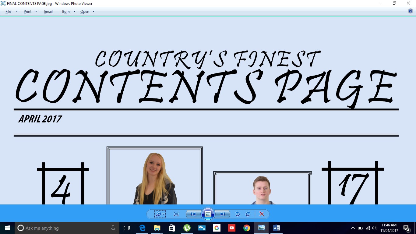
Contents page images


These are the images that I have photoshopped so that they have the correct colour background for my magazine. I don't have the original photos from the photoshoot but as soon as I do, I will upload them on my blog for you to see them. As I am showing you a closer version of what the photos look like in my contents page, I will eventually show you what my contents page looks like when it's completely finished.
Contents page adjustment to the title
I decided to add another line underneath the date as I think it looked more like something you would see in an actual music magazine. I got this from previous and existing music magazines so I decided to make this adjustment. Not only does this add depth and fits a running theme through the whole of the magazine, it fills up a little bit more space.
Front cover pictures
 This is what my front cover looks like with the added images in the circles. I think that it finishes the magazine off nicely as it isn't too much, it's just the right amount of images added to make it look well put together. The same goes for the image below.
Wednesday, 5 April 2017
Front cover update
 I have made a few adjustments to my front cover. I have changed the font completely to New Alt because it matches the font that's on the cover album on the double page spread.
 I have also created some circles to match the theme of having them on the double page spread. I have made the circles the same colour of the background with a white border around them to make them stand out and not to have the circles blending in with the background.
In addition to this, i have also made the font of "Cassidy Taylor" bigger and more slanted so that it appeals more to the eye. I also underlined it to make it look better and neater. I really like the look of it now, as it looks more like a country music magazine.
Double page spread development
 I have also added an album cover, as there is a chance to win it for viewers. I did this by just typing the name in and overlapping the name and the surname together to make it look like this.
 I will be adding a picture to this to make it look like an actual album cover.
I am taking the photos on Thursday so i will update you when i have competed them.
Double page spread update
Today i will be showing you my double page spread in which i have developed a little bit. I have added a circle to the bottom left hand corner just to break the writing up a little bit. I will be adding a photo in the circle to also give a bit more atmosphere and to give the readers a little bit more knowledge of what the article is about.
However, as the article is about bullying and not letting the haters get to you, the circles will resemble bullet holes and how they have been dodged and how she has come through it. In my research, there weren't any magazines that did this because the articles were all about artists releasing new albums and things like that. I, however, am going against that to be different and i like that.

However, as the article is about bullying and not letting the haters get to you, the circles will resemble bullet holes and how they have been dodged and how she has come through it. In my research, there weren't any magazines that did this because the articles were all about artists releasing new albums and things like that. I, however, am going against that to be different and i like that.

Monday, 3 April 2017
Front cover update

Hello, today i am going to show you the improvements i have made to my front cover. First of all, i have changed the font of the text because i wanted it to look a little fancy but also look professional.
On the other hand, i decided to move the text around as well as the image. Moving the image to the middle of the page matches my research that i did of the front covers. Moving the text to around the image also helps to centre the image and to make the attention go to the image.
Overall, i think i am going to keep this layout because it matches the research that i have done. However, i may play around with the writing and make it look presentable.
Friday, 31 March 2017
Double page spread adjusted sub-headline again
 I have changed the sub-headline again because i thought that the text was too bold for it to be a sub-headline, so by adjusting it and keeping it the same font, but changing the boldness and how much it slants, it looks like a proper sub-headline.
Contents page added circles
 I have added circles around these circles because i feel as though there should be a theme running throughout the whole of the magazine. On my contents page, i have done the same thing around the circle with the social media links on.
 I like having something around the circles as it adds more depth to the page. It also helps to fill up the space a little bit more.
I have done the exact same thing for this circle that is in the middle of the text. By having these circles in those places, it makes it look a lot prettier and more to my genre more.
Thursday, 30 March 2017
Contents page update
 I have decided to not only have boxes around the text of what the pages are about, but i have also added boxes around the pictures. This helps the page and just the pictures in general look neater and more in line with the text.
I really like the boxes as it kind of fills a really small amount of space on the page, but it also adds to the look of the contents page. I wanted to originally have an image dominated contents page, but it didn't really turn out well and i thought that i needed more images, so i chose to do the blocky look instead and it looks quite good, though it's not finished yet. I'll update you when it is finished.
Wednesday, 29 March 2017
Peer reviewing
Yesterday we did a peer review of each others work. By doing this, it allows us to gain feedback on how we are doing from another person's point of view. However, this also gave me improvements that needs to be done to my magazine and also my blog. I really liked what we did as it gave me a chance to see what other people are doing and how different everyone's work can be and also get inspiration for what i can blog about.
Tuesday, 28 March 2017
My Article
Q: Obviously every celebrity gets hate comments, but how do you deal with them?
A:The way every other celebrity deals with it really, just to ignore it and try to move on with my life. By letting all the comments get to you is not doing anything good for you, you just got to deal with it and try not to let it get to you. There are some pretty hurtful comments floating around social media these days, but all I say to myself is “They must have nothing better to do with their lives if they keep talking about me” I mean why talk about me if you don’t even like me. So yeah, just to ignore it and push past it, get through it as if it’s just a cold.
Q:Could give your fans a bit of advice about bullying and maybe talk a little about your experience with bullying?
A:A bit of advice for my fans would probably have to be to not let anyone get you down, all those bullies that you witness, there are simple things that you can do to help yourself or anyone else in need. Tell a teacher if it’s getting bad, but most importantly tell a parent. I remember when I was in middle school, I was constantly getting bullied because of my looks, the clothes I wore, the little things that you wouldn’t think mattered. I got bullied for all those things. The worst part was, I didn’t tell anyone about what was happening, I didn’t tell my parents, or a teacher. I dealt with it. I grew up to be the woman I am today just pushing past the haters and ignored them. That’s what I would say to my fans, to ignore it and tell an
adult, it’s not the end of the world.
Q:If you could go backto when you were younger and give yourself one bit of advice,what would it be?
A:Going back to when I was younger,I’d probably tell myself to not care on what anybody thinks
of me. I was very self-conscious with what I looked like and the only way to carry on with my life was to just keep my head down and not make eye contact with anybody. So I would tell myself that it’s their own opinion and it doesn’t matter, all that matters is my own opinion, no one elses, and to never forget that.
Q:Enough about that, lets talk music. So what does your music mean to you?
A:Music is everything to me, it’s practically my life. It helped me when I was down. It was the only thing that helped me with my problems. I could write down all my fears and problems and make them into a song and I wanted to share that with the world to help people who were my age when I was dealing with bullying you know. I want to inspire younger children to be who they are and to not let themselves get down because someone says they aren’t capable. Music, in my eyes, is my life and no bully/
hater is going to stop me from doing what I love.
Q:What do you think defines artist?
A:An artist to me is someone who can inspire someone else just by singing a song. An artist is also someone who can pour all of their emotions into a song and help teenagers get through with their lives.
Q:Whats it like to be touring the world?
A:It’s incredible. I never thought I’d get the opportunity to sing songs to the world, let alone tour it. It’s the most amazing feeling going out on stage and seeing all my fans singing along and holding signs up. It gives me the chills, because they inspire me to do what I’m doing.
Double page spread adjusted sub-headline
 I decided to change the font of the sub-headline from the font Goudy Old Style, to Myriad Pro.
I did this because the font matches the font of the writing in the circles, and this helps to show a theme running through the double page spread.
Double page spread update

I decided to have the circle straight because when it's on an angle, the writing isn't straight so by having the circle like this, it's keeping it safe and i feel as though it looks better.
Front cover photo update
This is the updated version of the front cover of my magazine. I decided to change it because i thought that the other image was too much. The person in the image was looking right at the camera, whereas the front covers that i have analysed don't tend to look at the camera, so i changed it. This is what it looks like.


Monday, 27 March 2017
Front cover photo adjustments

Regular image - Unphotoshopped

Photoshopped image
I decided to change the image for my front cover again because i thought that having the person in the image smiling at the camera was something that people on the front cover of magazines don't normally do. So, in order to have something different, i decided to have the person in the photo pose a little bit but not too much and to have them looking in another direction, besides looking at the camera. I like the overall look of the photoshopped image so i am going to put it on my magazine and i will do a separate blog to show you how it looks.
Contents page title
 I have added a line under the title of the page as it helps the title be more bold and grabs the attention more. I wanted to have something under the title because it just filled up the space a bit more but also helps to underline the title of the page.
I explored with the different types of lines that there were and have put a few of them into another blog for you to see. For example, there were dotted lines and dashes, slanted slashes etc.
Underlining ideas
These are a few examples of what underlining techniques i could have for my title on the contents page. I like all of these but just having something simple makes it stand out better. I feel like having something like the diamonds can ruin it and it wouldn't have a better effect. 


This is the one that i am going to be using because it's simple, effective and still stands out even though it's nothing much.


This is the one that i am going to be using because it's simple, effective and still stands out even though it's nothing much.
Contents page social media update

I have made a small addition to my contents page just to fill out a little bit more space and to make the circle look neater than it was. I really think that this addition has made the whole page stand out more, it also helps focus the attention more to the centre of the page so that people would be more likely to see the social media links and go follow them.
Friday, 24 March 2017
3) Posing Inspiration
 This is going to be the last analysis of a celebrity because I have been looking all over Google and other websites and I can't really find any images of celebrities that show their full bodies, it's showing a close up from the shoulders, and I want to know how they are standing so that I can use it as inspiration.
However, this is Carrie Underwood and I really like the idea of having the arm above the head so I am going to be using this as inspiration and making my model do that for my image. As Carrie is looking right at the camera, it gives us a sense of endearment as she's looking towards us, her fans. I am not going to be doing this, I am going to have my model look off camera so that it looks more like she's having fun and isn't someone who is constantly serious and always working on their music.
2) Posing Inspiration
 This is Julianna Alexandra Hough and she is a country artist and although it doesn't really look like she is, simply because of the way she dresses, she is. I like the way she is posing in this image because it's nothing too complicated or anything like that. She is simply just sitting on a chair and smiling off camera looking like she is enjoying life, just like every artist should be.
On the other hand, a lot of other music magazines that I have analysed, they don't tend to have the person smiling on the front cover, so that maybe something that I would have to change. Either have them looking in another direction and not at the camera and having a neutral face. Having someone smiling on the front cover is very rare and I don't want to go against that.
1) Posing Inspiration
 Hello, today I am going to be explaining what kind of position I am going to be having the person in my image for the front cover of the magazine. And to do this, I am going to be looking at celebrities and how they pose in front of the cameras for inspiration, I will also be looking at female country artists just so I know the difference between a country artist and a regular singer.
As everyone knows, this is Taylor Swift. She is positioned nicely in front of the camera. As she is posing a little bit, with having her hand on her hip and her other arm down by her side, this makes her look casual but professional. By having the pose and the position in the correct way, it allows the whole image to come together.
For an artist like Taylor, going from a country artist to a pop artist, her style and physique has changed completely. So this means that because her style has changed, her clothing and poses would have too.
Thursday, 23 March 2017
Contents page update
 I have added boxes to go around my text for my contents page. The boxes add depth towards the text and make it stand out a lot more than it would without the boxes. The boxes also helps the text to look neater and in line so that it doesn't look messy.
Subscribe to:
Comments (Atom)