Thursday, 23 March 2017

Addition to contents page

Hey guys, i am going to showing you why i have changed the font for the word "Love".
First reason is because i want it to stand out more so that it would catch the readers eye and make them want to read it. However, by adding this to the contents page, it adds more colour to the whole page.
Just a simple addition can make the whole page stand out just a little bit more than it did without the red font.

Wednesday, 22 March 2017

Changing the font


I have changed the font of the text that i had in the circle on the right hand side of my double page spread.

The reason for my choices are because i have used this font for the headline of my article and for a quote that i have also added in the middle of my article in another circle. Another reason for my actions towards this is because it matches and co-ordinates well with the rest of the double page spread.

As for having the same text on the same page, it also allows the reader to easily read it because the font is something that is easy to read and is neater than most others. I like this font as it looks well organised and it isn't messy or hard to read.

Front cover images needs changing

I am going to be re-taking the images that are in the smaller circles on my front cover partially because they need to be looking like they are at least enjoying themselves. However, i will also be changing the type of shot that i take. Having 2 images on the front cover, both as a close up of the face isn't something that an existing country music magazine would have. In addition to this, i am also going to be changing the colour of the background of the smaller images as well because just having the white can come off as boring and nobody wants to see that.

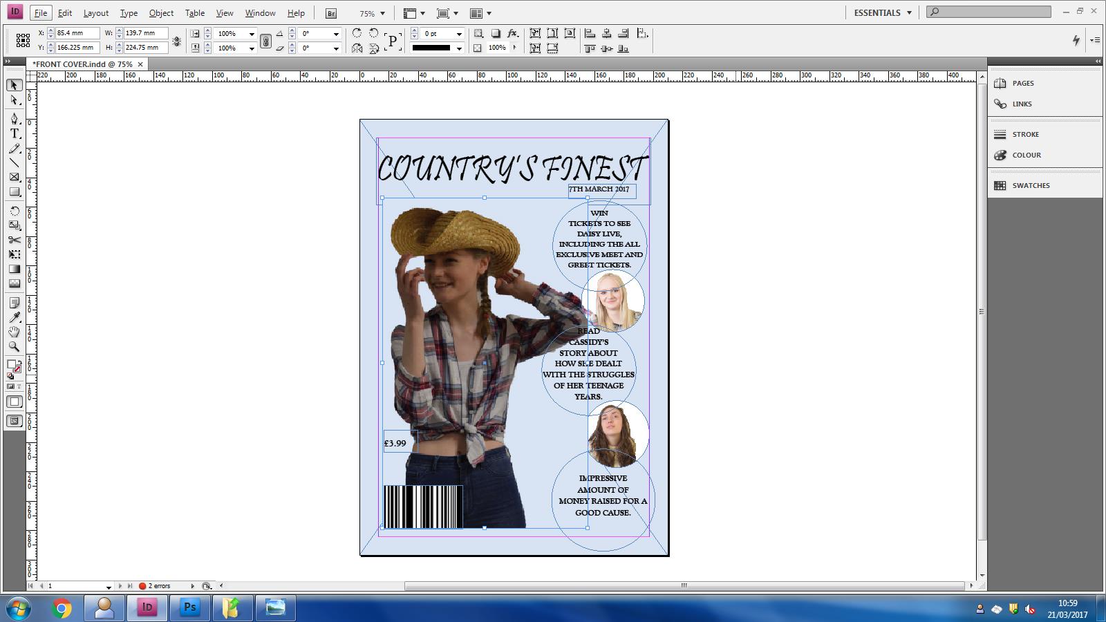
Barcode numbers

Today i am going to be showing you how to make the numbers for the barcode. It's actually very simple and doesn't take long to do.

All you have to do is create a text box that fits the width of the barcode. And what i did was find an existing magazine and looked at the numbers on the barcode.

I then typed the numbers into the text box and changed the colours around as the colour of my background is too light for the numbers to be of the colour white.

So, i changed the inside colour of the numbers to white and the outside colour of the numbers black so that it would stand out against the light blue colour of the background. Then adjust the text box to the correct place under the barcode so that it looks like a proper barcode.

Tuesday, 21 March 2017

Front cover photo

I have developed my front cover photo as the last one was not a good idea as you couldn't see the face of the person.

However, for my new photo, i have used to photo that was in the old contents page and used it for the front cover because it looks more like a photo that belongs on the front cover.

On the other hand, by having this image, it really helps tie the front cover together as the image goes well and co-ordinates well with the other images and the text matches the images. I really like the outcome of this front cover. The only thing that needs to be changed is the barcode, as i need to add numbers. I will blog about this and show you how i did that at a further date.

Contents page social media


Hello! Today i am going to be showing you the addition i have made to my contents page.

To make this contents page more interactive towards fans and everyone else of the public, i added some social media platforms that would allow the public to do this. 

In addition to letting the public interact with the magazine company, it would also allow them to get a sneak peek of the newest magazines and get the chance to enter more competitions than people who just read the magazine would.

This is the final product of the social media links. I like the overall look because it holds the whole contents page together nicely.

Monday, 20 March 2017

Addition of the quote

I have  a quote in the middle of my article which really helps break it up to help the readers want to read it.

I really like it as it looks neat and professional. However, the colour also synchronises with the other circle that i have on the double page spread of the chance to win an album.

I like how the text of the article goes around the circle as if it's meant to be there. In addition to this, i really like how the font of the quote in the circle is the same as the headline of the whole double page spread. It co-ordinates and contrasts well and i really like the overall outcome.